Low contrast between tile and grout color (ex. white tile with warm gray grout) puts visual focus on the tile and creates a harmonized look. Low contrast allows the beauty of the tile to stand out.
(See example to the right)
High contrast between tile and grout color (ex. white tile with black grout) will create a very bold look and can easily become the focal point of a kitchen if used on a backsplash, for example. High contrast between tile and grout color brings attention to the shape of the tile and pattern of the tile layout.
(See example below)
Low contrast between tile and grout color
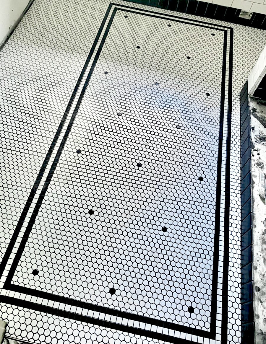
High contrast between tile and grout color
Some of the most common grout colors used are listed below:
Brilliant white
Grays - Warm gray, Frosty
Beiges - Mink, Almond
Black
Many tile shops offer assistance in choosing a grout color for those who prefer to look in person.